10.Moleculesコンポーネント
この章では、アトミックデザインのMoleculesコンポーネントを作成します。 もう一度Moleculesコンポーネントの定義を確認します。
Moleculesの原則
- 特定のプロダクト (Web サイト) についての知識を持たない
- 1つ以上のコンポーネントを組み合わせて構成されるようなWeb UIの知識 (機能) を持つ
- いくらかの複雑性はもつがこれ単体では成立しない
webサービス開発でよく使われるコンポーネントをまとめました。
ThreeDots
ThreeDots は3つのドットを点滅させるアニメーションを持つコンポーネントです。 主にボタンなどのテキスト部分に利用され、サーバーに問い合わせたり、何らかの時間がかかる処理がなされる時に、 ユーザーに待機中であることを提示します。
touch atomic/molecules/ThreeDots.tsx
 import { Box, Motion } from '../'

 interface ThreeDotsProps {
   bg?: string
   size?: number
   span?: number
 }

 export function ThreeDots({ bg = 'black', size = 10, span = 4, ...props }: ThreeDotsProps) {
   const DOT_COUNT = 3

   return (
     <Box display="flex" alignItems="center" justifyContent="center" {...props}>
       {Array(DOT_COUNT)
         .fill({})
         .map((_, i) => (
           <Motion
             key={i}
             mx={i === 0 || i === DOT_COUNT - 1 ? 0 : span}
             animate={{ opacity: [0.1, 0.9] }}
             transition={{
               delay: i * 0.3,
               duration: 1,
               repeat: Infinity,
               repeatType: 'mirror',
               repeatDelay: 0.1,
             }}
             width={size}
             height={size}
             borderRadius={size}
             bg={bg}
           />
         ))}
     </Box>
   )
 }
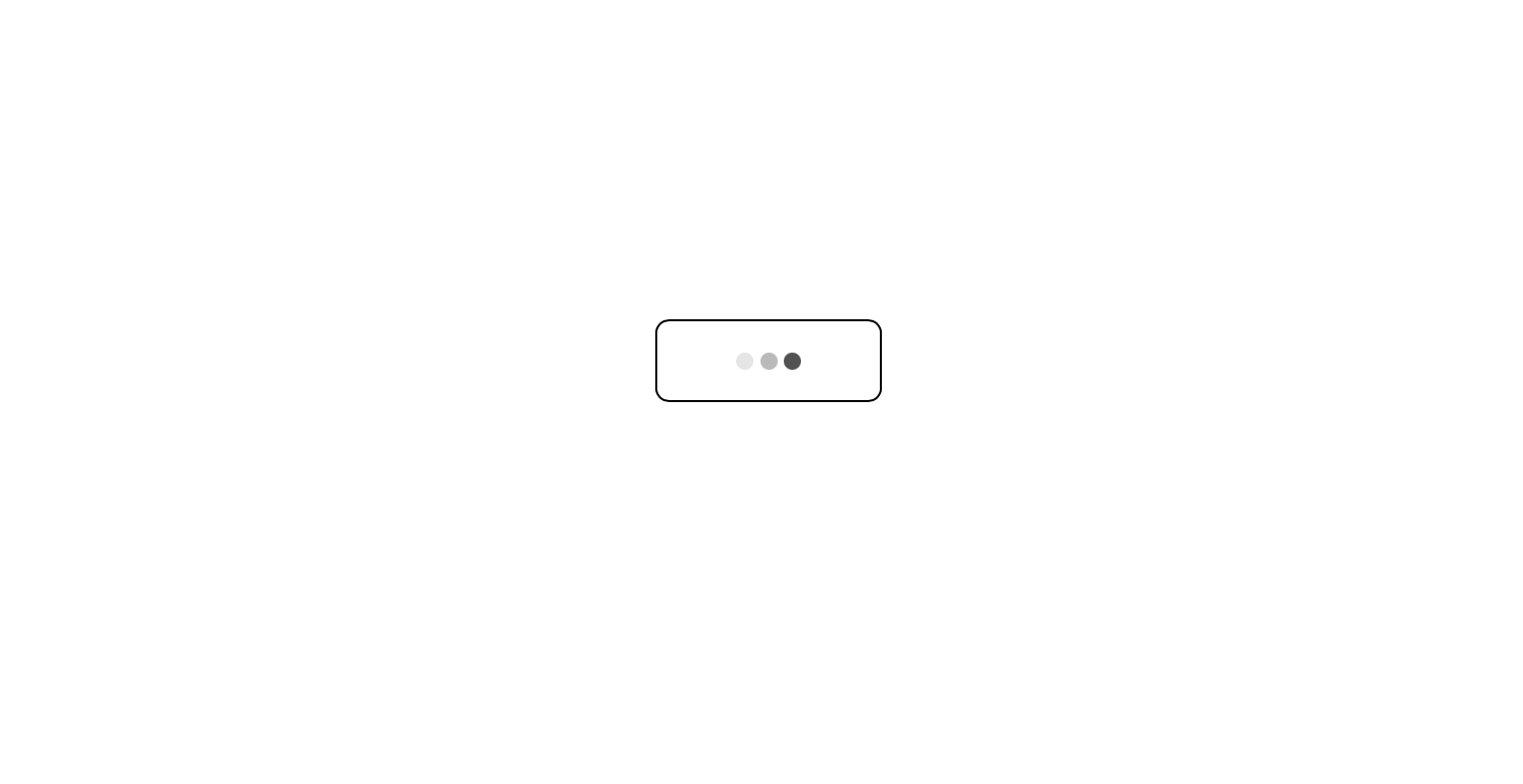
上の画像の三つのドット部分が ThreeDots コンポーネントに該当します。
Alert
Alertコンポーネントは何らかの通知をユーザーに知らせるコンポーネントです。
このコンポーネントは一定時間 props.childrenで渡されたコンポーネントが表示され、その後は消えるという処理をします。
記載が特殊で、ReactのClasコンポーネントで書かれています。
理由はコンポーネントのライフサイクルがファンクショナルだとうまく制御できず、
消えたはずの通知が表示されたりと、問題が多かったためcomponentDidMountとcomponentWillUnmountが利用できるそちらを選びました。
touch atomic/molecules/Alert.tsx
import React from 'react'
import { motion } from 'motion/react'

interface AlertProps {
  id?: string | number
  autoDelete?: boolean
  deleteTime?: number
  onDelete?: (id?: string | number) => void
  children?: React.ReactNode
}

interface AlertState {
  visible: boolean
  autoDelete: boolean
  deleteTime: number
}

export class Alert extends React.Component<AlertProps, AlertState> {
  static defaultProps = {
    autoDelete: true,
    deleteTime: 3000,
    onDelete: () => {},
  }

  // タイマーの管理用
  timer: number | undefined
  AnimeTimer: number | undefined

  constructor(props: AlertProps) {
    super(props)
    this.state = {
      visible: true,
      autoDelete: props.autoDelete!,
      deleteTime: props.deleteTime!,
    }
  }

  componentDidMount() {
    if (this.state.autoDelete) {
      // deleteTime 経過後、opacity を 0 にすることで exit アニメーションを実行
      this.AnimeTimer = window.setTimeout(() => this.setState({ visible: false }), this.state.deleteTime)
      // exit アニメーションの遅延を考慮して onDelete を呼ぶ
      this.timer = window.setTimeout(() => this.props.onDelete!(this.props.id), this.state.deleteTime + 500)
    }
  }

  componentWillUnmount() {
    if (this.state.autoDelete) {
      window.clearTimeout(this.AnimeTimer)
      window.clearTimeout(this.timer)
    }
  }

  render() {
    return (
      // AnimatePresence の代わりに常に motion.div をレンダリングし、
      // animate の値を state.visible で切り替える
      <motion.div
        initial={{ opacity: 0 }}
        animate={{ opacity: this.state.visible ? 1 : 0 }}
        transition={{ duration: 0.5 }}
        style={{ marginBottom: '1.25rem' }} // mb={5} の代替
      >
        {this.props.children}
      </motion.div>
    )
  }
}
アニメーションの時間と通知を削除する時間に0.5秒の遅延を入れています。
onDeleteでnotifications配列から通知を消すと、DOM本体を再レンダーで削除してしまい
opacityで消える時間が0秒となり結果アニメーションがなくなってしまうからです。
Moleculesコンポーネントは使い方に癖があるのでサンプルを書いておきます。
ページコンポーネントで通知を持つ配列を宣言します。 配列に通知のメッセージを追加、削除する関数を作成します。
const [notifications, setNotifications] = useState([])
const createNotification = (message) => setNotifications([...notifications, { id: Math.random(), message }])
const deleteNotification = (id) => setNotifications(notifications.filter((notification) => notification.id !== id))
createNotificationは通知のメッセージを受け取り、idとともにオブジェクトにして配列に収めます。
deleteNotificationはidを受け取り、そのidを含むオブジェクトを削除して配列を更新します。
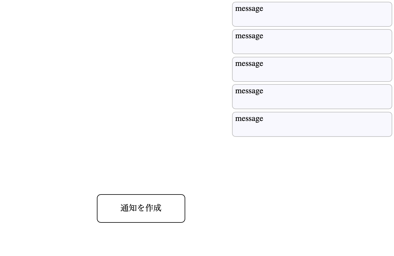
メッセージを投げて、通知を作成します。
createNotification('予期しない問題が発生しました')
アラートを表示するときはmapで通知に収まった要素分表示します。
AlertコンポーネントにはidとonDelete を渡します。
デフォルトの消滅時間3秒が来れば通知は自動的に削除されます。
<Box position="absolute" top="15px" right="20px">
  {notifications.map(({ id, message }) => (
    <Alert key={id} onDelete={deleteNotification} id={id}>
      <Box
        width={320}
        minHeight={50}
        borderRadius={7}
        border="1px solid silver"
        bg="ghostwhite"
        px={5.5}
        py={3}
        style={{ overflowWrap: 'break-word' }}
      >
        {message}
      </Box>
    </Alert>
  ))}
</Box>
<Clickable onClick={() => createNotification('Message')} width={100} height={40} bg="red" />
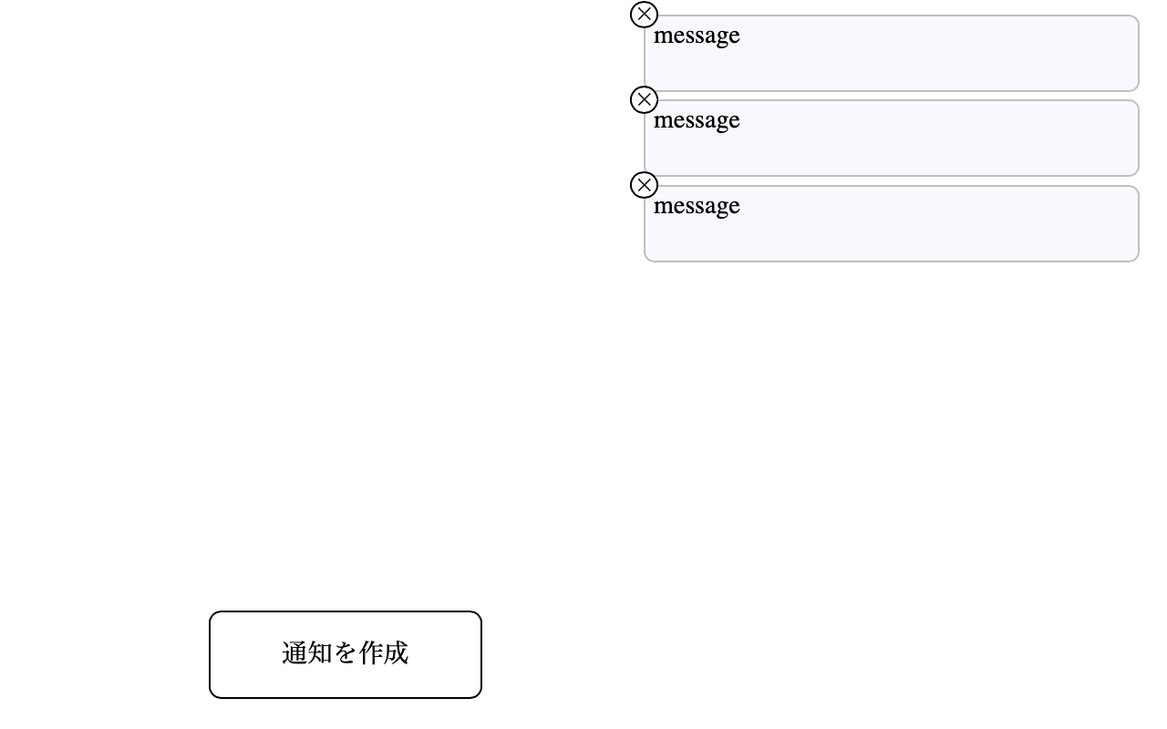
自動的に削除させるのではなく、バツボタンで消せるようにしたい場合はこのように変更します。
<Box position="absolute" top="15px" right="20px">
  {notifications.map(({ id, message }) => (
    <Alert key={id} onDelete={deleteNotification} id={id} autoDelete={false}>
      <Box
        position="relative"
        width={320}
        minHeight={50}
        borderRadius={7}
        border="1px solid silver"
        bg="ghostwhite"
        px={5.5}
        py={3}
        style={{ overflowWrap: 'break-word' }}
      >
        <Clickable
          width={18}
          height={18}
          position="absolute"
          top={-10}
          left={-10}
          display="flex"
          alignItems="center"
          border="1px solid black"
          borderRadius={10}
          bg="white"
          onClick={() => deleteNotification(id)}
        >
          <Svg name="Close" width={8} mx="auto" stroke="black" />
        </Clickable>
        {message}
      </Box>
    </Alert>
  ))}
</Box>
<Clickable onClick={() => createNotification('Message')} width={100} height={40} bg="red" />
SwitchItem
SwitchItemは隠れているコンテンツを表示、非表示するコンポーネントです。
touch atomic/molecules/SwitchItem.tsx
import { Box, Motion } from '../'

export function SwitchItem({ isOn, children, ...props }) {
  return (
    <Box width="100%" {...props}>
      <Motion
        initial={{
          opacity: 0,
          height: 0,
        }}
        animate={
          isOn
            ? {
                opacity: 1,
                height: 'auto',
                transition: {
                  duration: 0.2,
                  ease: [0.11, 0.83, 0.24, 0.89],
                },
              }
            : {
                opacity: 0,
                height: 0,
                transition: {
                  duration: 0.2,
                  ease: [0.11, 0.83, 0.24, 0.89],
                },
              }
        }
        overflow="hidden"
      >
        {children}
      </Motion>
    </Box>
  )
}
使い方は、表示、非表示を管理するステートを作り。
const [isOn, setIsOn] = useState(false)
状態を更新するボタンと、表示、非表示を切り替える内容をSwitchItemコンポーネントで囲みます。
<SwitchItem isOn={isOn}>
  <Box border="solid 1px black" height={100} width={200} p={15}>
    表示を切り替えたいコンテンツ
  </Box>
</SwitchItem>
<Clickable onClick={() => setIsOn(!isOn)}>コンテンツを表示</Clickable>

TabContent
TablContentは表示されている画面上で、ページを遷移させずに表示している内容を切り替えるコンポーネントです。 SwitchItemとの違いはこれらです。
- アニメーションがない
- 2つ以上のコンテンツを表示分けできる
touch atomic/molecules/TabContent.tsx
import React from 'react'
export function TabContent({ id, activeTab, children }) {
  return activeTab === id ? <>{children}</> : null
}
使い方をかいておきます。 アクティブなタブの状態を持つステートを作成します。
const [activeTab, setActiveTab] = useState('tab1')
表示内容を切り替えるコンポーネントを記載します。。
<TabContent id="tab1" activeTab={activeTab}>
  <Box border="solid 1px black" height={100} width={200} p={15}>
    内容1
  </Box>
</TabContent>
<TabContent id="tab2" activeTab={activeTab}>
  <Box border="solid 1px red" height={100} width={200} p={15}>
    内容2
  </Box>
</TabContent>
<Clickable onClick={() => setActiveTab('tab1')}>内容1を表示</Clickable>
<Clickable onClick={() => setActiveTab('tab2')}>内容2を表示</Clickable>

moleculesコンポーネントのエクスポート
作成したmoleculesコンポーネントをエクスポートします。
//...省略...
 export * from './molecules/ThreeDots'
 export * from './molecules/Alert'
 export * from './molecules/SwitchItem'
 export * from './molecules/TabContent'
git add .
git commit -m "Create Molecules components"