11.Organismsコンポーネント
Organismsコンポーネントの原則を書いておきます。
- 特定のプロダクト (Webサイト) についての知識を持つ
- それ単体で Web サイト内で存在できる
これが、要は大半のReactを利用したコンポーネントに該当する。
プロジェクトに依存する情報を持つので、このレベルのコンポーネントからは
atomicのディレクトリから外して、Next.jsのプロジェクトルートにcomponentsフォルダを作成し、その中に各種コンポーネントを作成する。
サンプルコンポーネントとして、 大体どのサービスにもあるヘッダーとフッターのコンポーネントを作ってみましょう。
mkdir components
Headerコンポーネント
最初にヘッダーで利用するメニューボタンのコンポーネントを作成します。
touch components/MenuButton.tsx
components/MenuButton.jsx
import React from 'react'
import { motion, Transition } from 'framer-motion'
import { Motion } from '../atomic/'

const MenuButton = ({
  isOpen = false,
  width = 24,
  height = 24,
  strokeWidth = 1,
  color = '#000',
  transition = null,
  lineProps = null,
  ...props
}) => {
  const variant = isOpen ? 'opened' : 'closed'
  const top = {
    closed: {
      rotate: 0,
      translateY: 0,
    },
    opened: {
      rotate: 45,
      translateY: 2,
    },
  }
  const center = {
    closed: {
      opacity: 1,
    },
    opened: {
      opacity: 0,
    },
  }
  const bottom = {
    closed: {
      rotate: 0,
      translateY: 0,
    },
    opened: {
      rotate: -45,
      translateY: -2,
    },
  }

  const unitHeight = 4
  const unitWidth = (unitHeight * width) / height
  lineProps = {
    stroke: color,
    strokeWidth: strokeWidth,
    vectorEffect: 'non-scaling-stroke',
    initial: 'closed',
    animate: variant,
    transition,
    ...lineProps,
  }

  return (
    <Motion
      as="svg"
      animate={isOpen ? 'open' : 'closed'}
      viewBox={`0 0 ${unitWidth} ${unitHeight}`}
      overflow="visible"
      preserveAspectRatio="none"
      width={width}
      height={height}
      {...props}
    >
      <motion.line x1="0" x2={unitWidth} y1="0" y2="0" variants={top} {...lineProps} />
      <motion.line x1="0" x2={unitWidth} y1="2" y2="2" variants={center} {...lineProps} />
      <motion.line x1="0" x2={unitWidth} y1="4" y2="4" variants={bottom} {...lineProps} />
    </Motion>
  )
}

export { MenuButton }
ヘッダーを作成します。
touch components/Header.tsx
components/Header.jsx
import { useState } from 'react'
import { MenuButton } from './MenuButton'
import { Box, Link, Text, Motion, Svg } from '../atomic/'

const variants = {
  open: { opacity: 1, x: '-300px' },
  closed: { opacity: 0.8, x: 0 },
}

const ButtonVariants = {
  open: { x: '-200px' },
  closed: { x: 0 },
}

export default function Header({ props }) {
  const [isOpen, setIsOpen] = useState(false)
  const menuButtonStyle = { cursor: 'pointer' }

  return (
    <Box as="header" display="flex" height={[60, null, 80]} px={[16, null, 60]} overflow="hidden" {...props}>
      <Box display="flex" alignItems="center" justifyContent="center">
        <Link href="/" display="flex" alignItems="baseline">
          <Svg name="Home" height={16} />
          <Text fontSize={18} lineHeight={1} display={['none', 'block', null]} ml={4}>
            DTM
          </Text>
        </Link>
      </Box>
      <Box ml="auto" display="flex" alignItems="center" justifyContent="center">
        <Link display={['none', 'block', null]} href="/" color="black">
          DTM
        </Link>
        <Box zIndex={2} ml={10}>
          <MenuButton
            isOpen={isOpen}
            onClick={() => setIsOpen(!isOpen)}
            style={menuButtonStyle}
            variants={ButtonVariants}
          />
        </Box>
      </Box>
      <Motion
        position="fixed"
        display="inline"
        top={0}
        bottom={0}
        right={-300}
        animate={isOpen ? 'open' : 'closed'}
        variants={variants}
        bg="white"
        borderLeft="solid 1px black"
        width={[250, null, 295]}
        height="100vh"
        px={10}
        pt={60}
        zIndex={1}
      >
        <Link display={['block', 'none', null]} href="/" color="black">
          DTM
        </Link>
      </Motion>
    </Box>
  )
}
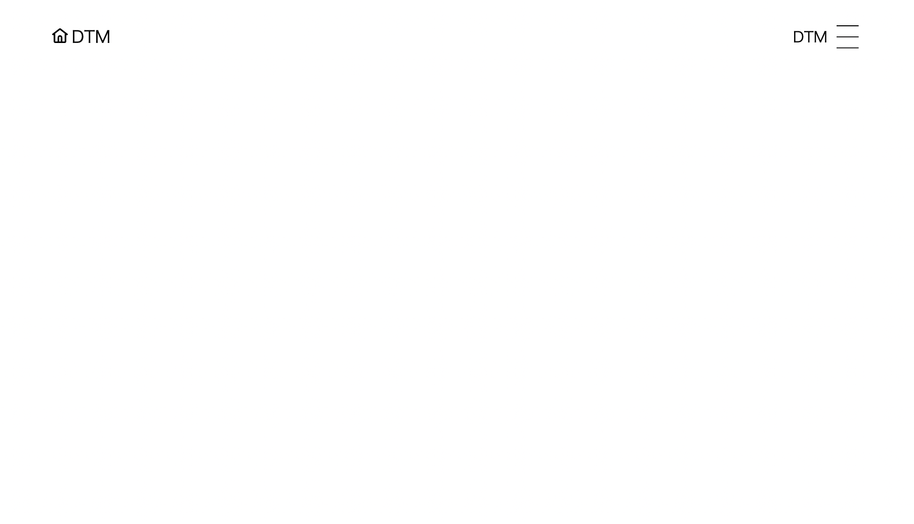
こんな感じのヘッダーができる。
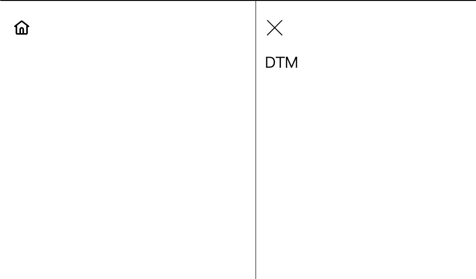
メニューボタンを押すと、このようにメニューが開く。
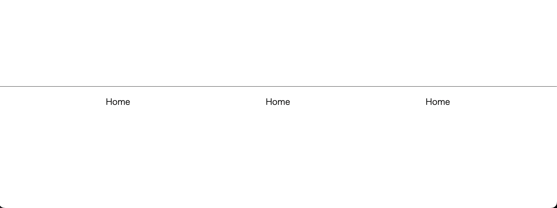
フッター
フッターのファイルを作成
touch components/Footer.tsx
components/Footer.tsx
import { Box, Link, Text } from '../atomic/'

export default function Footer({ props }) {
  return (
    <Box
      as="footer"
      display="flex"
      width="100%"
      px={45}
      pt={20}
      pb={150}
      borderTop="solid 1px black"
      mt={['calc(100vh - (100vh - 310px))', null, 'calc(100vh - (100vh - 190px))']}
      {...props}
    >
      <Box flexDirection={['column', 'row', null]} display="flex" mx="auto" flex="auto" maxWidth={[680, null, 920]}>
        <Box display="flex" flex="auto" mb={[30, 0, null]}>
          <Link href="/" mx="auto">
            Home
          </Link>
        </Box>
        <Box display="flex" flex="auto" mb={[30, 0, null]}>
          <Link href="/" mx="auto">
            Home
          </Link>
        </Box>
        <Box display="flex" flex="auto">
          <Link href="/" mx="auto">
            Home
          </Link>
        </Box>
      </Box>
    </Box>
  )
}
git add .
git commit -m "Create Header and Fotter components"